“Never attribute to malice that which can be adequately explained by stupidity.”
I hear this a lot, mostly from would-be cynics who don’t realise just how naïve and trusting they sound. I guess the UX equivalent would be something like: “Never assume an organisation is making things hard for the user on purpose.” I’m sure plenty of organisations create their rubbish user experiences purely by accident. If you’re not putting any resources into user testing or iterative design, you can create a confusing, frustrating web interface (or real-life situation) without realising that’s what you’re doing. And if you have a policy of trying to limit and ignore complaints, you may never find out that’s what you’ve done. It’s hard to understand what’s putting off potential customers, especially when you insist that people must supply a receipt before you’ll listen to their feedback.
But some UX problems fall into a different category: the sneaky nudge. This is when the confusion experienced by the user just so happens to benefit the organisation who designed the interface. If you’ve read the book Nudge or seen the Nudge blog, you’ll understand the concept of a nudge: a minor change to the context in which a decision is made can influence that decision. That’s why fast-food restaurants ask if we want fries with that – because being asked if you want fries increases the chances that you’ll order fries. My own experience of working in retail has taught me that “Do you need a bag?” makes people less likely to accept a bag than “Would you like a bag?” and that, for some reason, “Would you like a small bag?” is a nearly-irresistible offer.
Many web-interface nudges are just the online equivalent of the well-known “chocolate at the checkout” ploy: the opportunity to send a balloon with your gift or card, the opportunity to spend just £15 more and get free postage worth...well, less than £15, but free postage is free postage, right?
I was recently sent into a minor tailspin by a clever nudge on BeautyBay. At checkout you are given two choices:
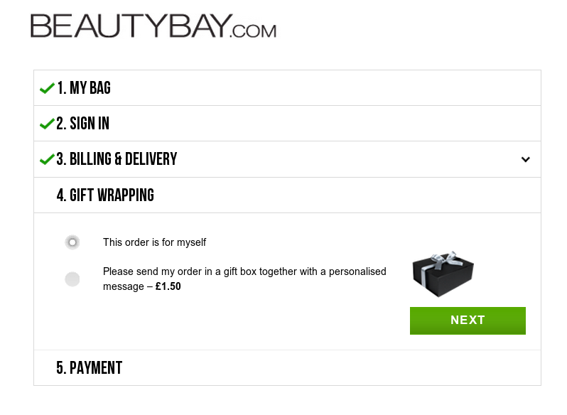
This order is for myself
Please send my order in a gift box together with a personalised message - £1.50.
I didn’t want to pay £1.50 to send the item in a gift box. But the item was for someone else, and it cost me some mental effort to select the “This order is for myself” button. Maybe it would be less painful for less literal-minded site users, but my guess is that the shaping of the choices forces every new user to pause and think for at least a second or two.
But some nudges go beyond clever into the murky realms of sneaky. Here’s what you see when you try to buy an item from the online store Very.
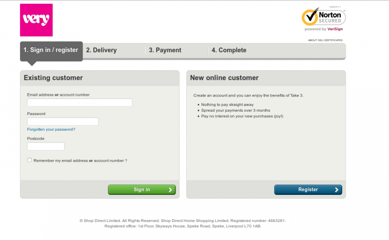
You’re given two options: sign in as an existing customer or sign up as a new customer. No option for “please just let me buy it without registering”, but these enforced relationships are par for the course in the world of online retail. What’s maybe slightly worrying is the bit on the right about how creating an account lets you “enjoy the benefits of Take 3”. (It's hard to read in the screenshot, but if you don't want to take my word for it you can go to the Very site, put an item in your basket and go to the checkout page yourself.) What is Take 3? There isn’t a proper explanation but it sounds like some kind of credit agreement.
How many people visit a clothing website because they’re actively seeking a credit agreement? Why would you click “Checkout” on your order if you didn’t have a payment method worked out already? But the decision has been re-framed. It’s no longer about whether or not you want a credit agreement. It’s a straight choice between abandoning the transaction and clicking Register.
You go ahead and click Register. You then have to fill in a form with lots of personal information. If you try to leave out your date of birth, you get an error message claiming: “We need your date of birth in order to protect your account.” Okaaaaay.
Of course you have to give a phone number. Of course you have to remember to un-tick the “Send me offers from carefully selected third parties” box. Of course they want a password and then reject the first one you enter because it’s just too damn memorable and easy. Of course the whole process is slow and fiddly and hateful and seemingly designed to make you give up and go away without buying the item. I would put all that in the category of “unintentionally crap” rather than “crap by design”.
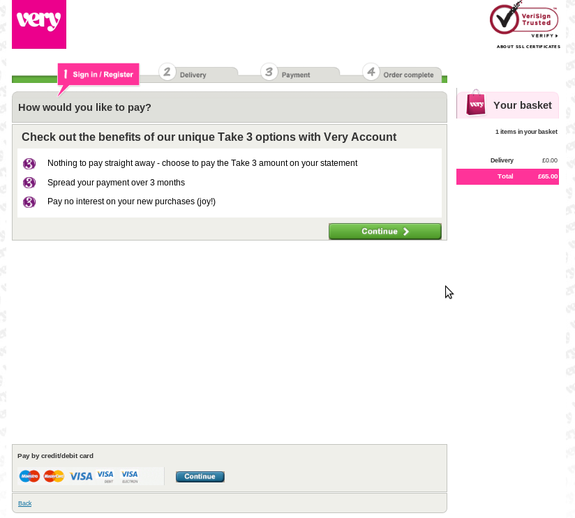
But then you get to the next page. You’re presented with three payment options in bright pink:
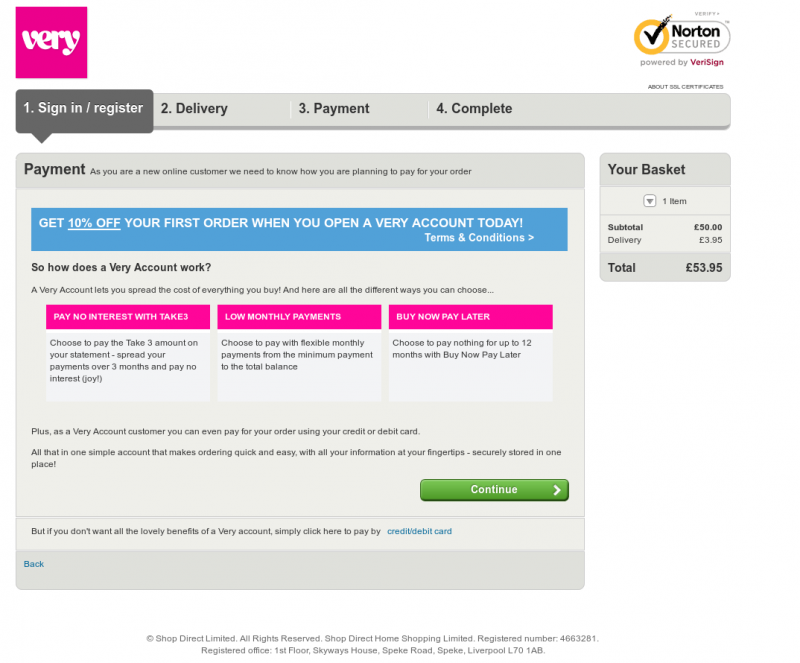
Pay no interest with Take3
Low monthly payments
Buy Now Pay Later
Three options. None of which involve just paying for your purchases in full without entering into a credit agreement. But if you try to select one with your mouse, you’ll see the little pink-topped boxes aren’t clickable. The only obvious clickable link is the green button saying Continue.
If you look at the page quite carefully, you’ll eventually spot that at the bottom, as an unstyled weblink, is the option to pay for your item by credit or debit card and miss out on “all the lovely benefits of a Very account”. But if you’re short-sighted, or not very observant, or in a hurry, you’ll just click on Continue and go through to the application page for a Very credit agreement. I’m ashamed to admit I fell for this when I was buying a dress from Very in autumn 2011. Back then, the interface was slightly different but the general idea was the same.
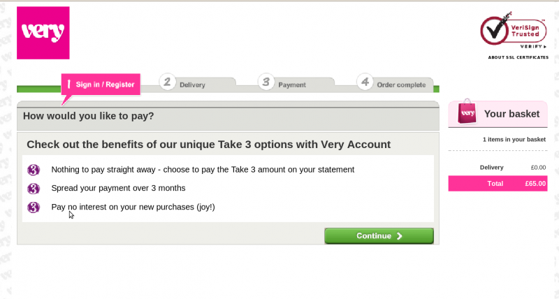
I clicked Continue thinking I was dismissing an advert for Take 3 and getting on with my purchase. Actually, this page gives you a choice between applying for a Take 3 account and paying by card. I just failed to spot the card option at the bottom of the page.
In other words, I "chose" to begin applying for a Take 3 account. I then proceeded to fill in all my details until a request for my previous addresses made me suspicious. I finally realised that I was applying for a financial product, not buying a dress.
Sometimes designers of a user experience make it confusing because they’re not paying enough attention. (Sometimes they don’t even know they’re designing a user experience). But sometimes a user experience is bad because it’s been deliberately designed that way. Sometimes UX designers use fairly sophisticated tools of the trade to push the user towards certain “choices” without caring about what the user really wants. I will leave you to make up your own mind about Very - now that I’ve finished nudging you.